Branding a Sober Brotherhood
The Project
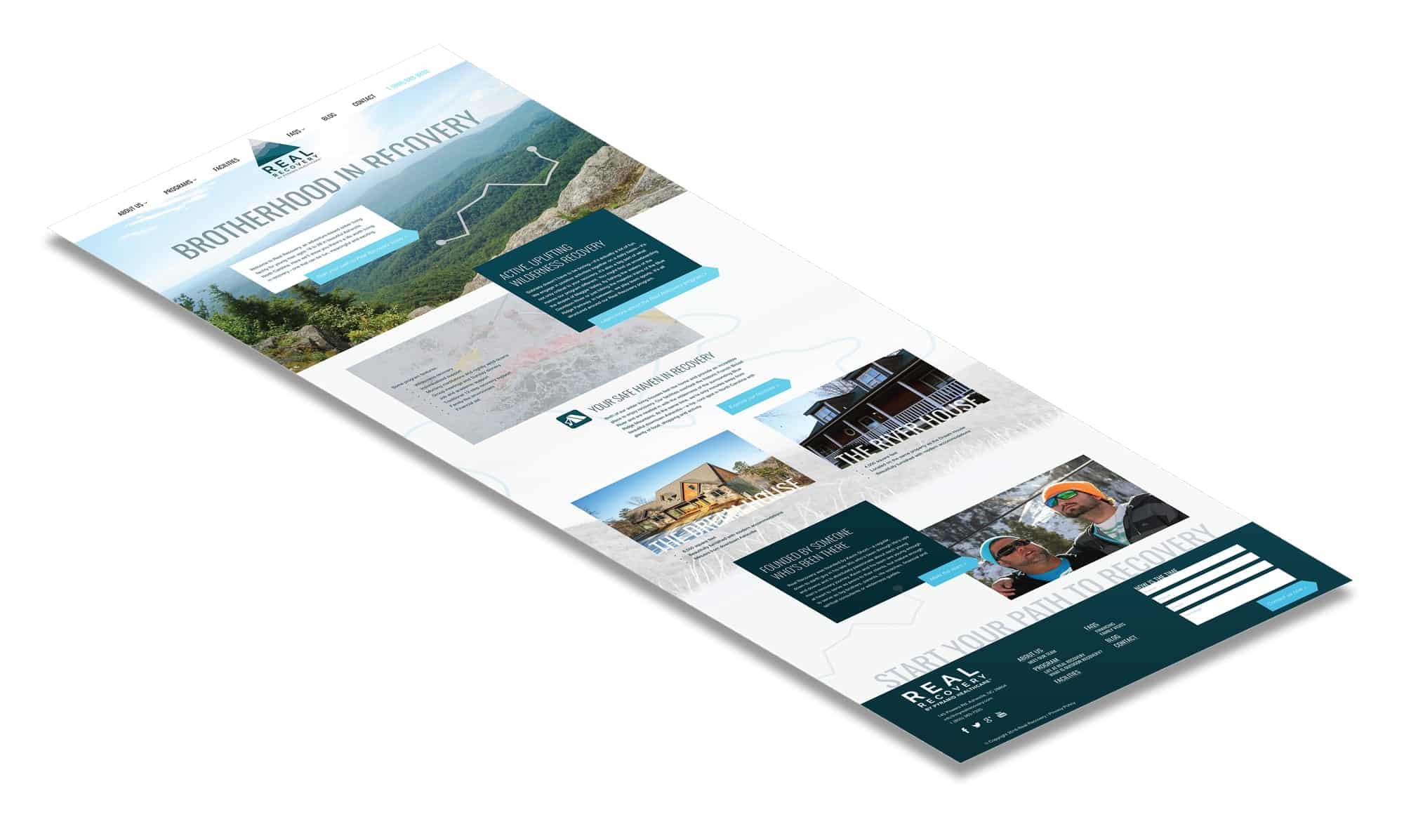
Between snowboarding, hiking and exploring the city of Asheville, North Carolina, Real Recovery offers young men a unique opportunity to grow with other like-minded individuals and to learn that living sober is fun and meaningful.
Unfortunately, Real Recovery’s marketing materials did not accurately convey all the things that make this sober living facility special. Now a part of Pyramid Healthcare, Real Recovery came to Active Marketing seeking branding, web design and print work.
The Strategy
Based on these factors, the brand needed to convey a strong sense of fun and adventure—without making it appear as if all the men do at Real Recovery is go on trips.
We chose a masculine color palette of dark greens, blues and grays complemented with a sans serif font and a photography style that exudes four characteristics: organic, authentic, rustic and inspirational.
About Real Recovery
Located in the heart of the beautiful Blue Ridge Mountains sits a parcel of property where groups of young men have decided to start living sober. These young men come from all walks of life, but each shares a common trait: the desire to get and stay sober and the desire to create a life worth living in the process.