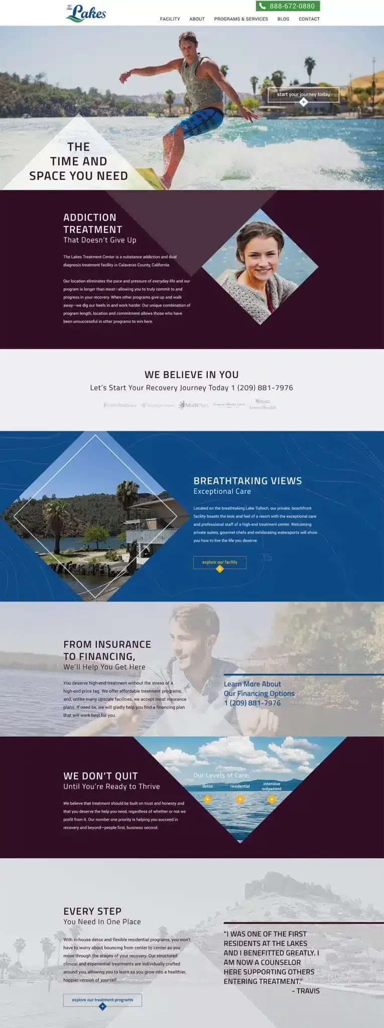
Addiction Treatment That Doesn’t Give Up
The Project
The Lakes Treatment Center engaged Active Marketing to create a strong, memorable brand and to carry that brand experience across a customized and fully responsive WordPress website. The website was to be designed to speak to potential clients ready to enter a treatment center—not for their first time, but for their last.
")
The Strategy
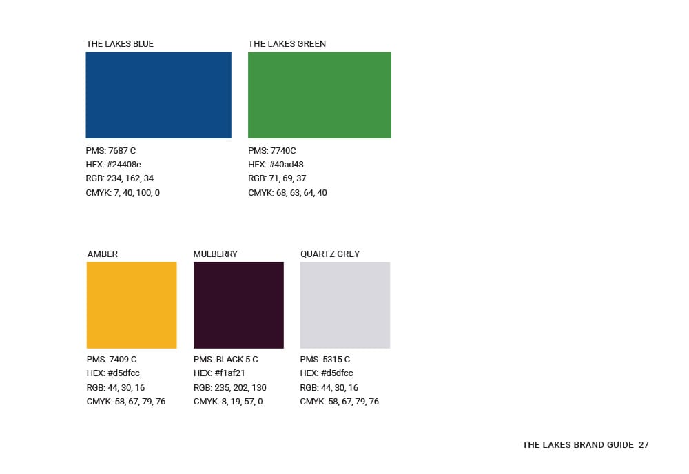
To showcase the unique environment at The Lakes Treatment Center, Active Marketing relied on a bold and crisp color palette, uncommon in the treatment industry, to ensure that the brand stood out and connected with its potential clients. Rather than replicating logo elements to create texture and depth—also a common design practice—Active Marketing relied on nautical charts and typographic maps to incorporate the lakefront aspect of the facility.
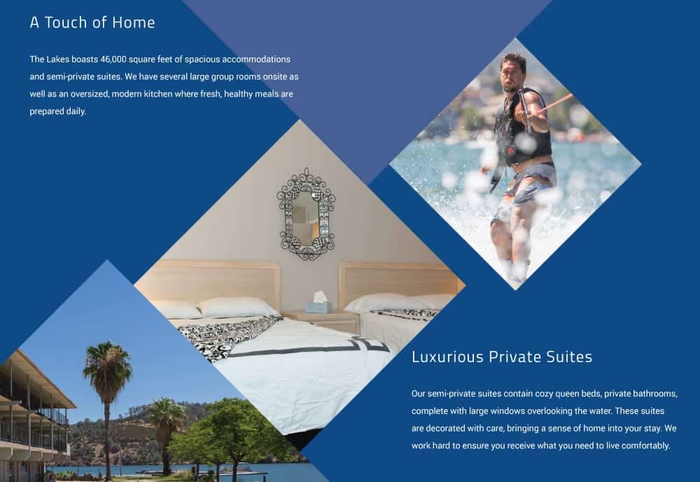
photography used on the site is indicative of the true experience and progress all clients of The Lakes Treatment Center can expect. Rather than relying on stock photography to create the visual experience, The Lakes Treatment Center hired a professional photographer to come on site and capture the true essence of Lake Tulloch and the facility. Bold angles are used throughout the site to guide the visitors’ eyes toward points of conversion.
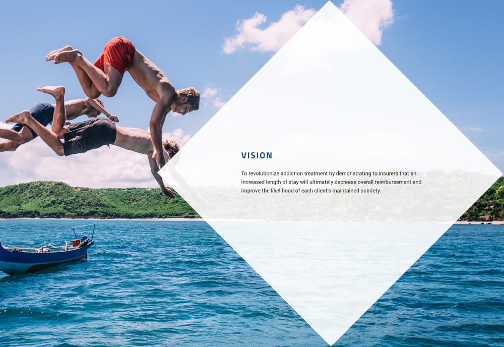
Brand Vision
Color Palette
Design Elements
About The Lakes
Treatment Center
The Lakes Treatment Center boasts a special location, unique program length and relentless commitment as key differentiators when it comes to the in-house detox and residential addiction treatment programs they offer at their facility in Copperopolis, California. Located on the pristine and expansive shores of Lake Tulloch, The Lakes allows clients to escape the pace and pressure of everyday life and focus on their recovery.