 What makes a landing page awful?
There are some aspects of awfulness that are simply no-brainers. Inconsistent typography, a clashing color palette and illegible copy are some awful design practices that seem obvious to most.
However, more subtle issues can easily be overlooked and push your landing page into the dreaded awful category. Let’s avoid that. Read on my friend.

Call Credit RX
1. Just plain awful
This header looks like a bad infomercial threw up on it. I have no idea what is going on here. Is “Call Credit RX ” the company logo or what? I can barely read the text with that god-awful drop shadow. The design is so bad credibility is lost instantly.
2. Ugly and ignorant
This graphic not only looks unprofessional but it reads, “No credit denied anymore.”
3. Annoying
This lady is so incredibly annoying and adds nothing to the page. At least they have a mute button, but really people?
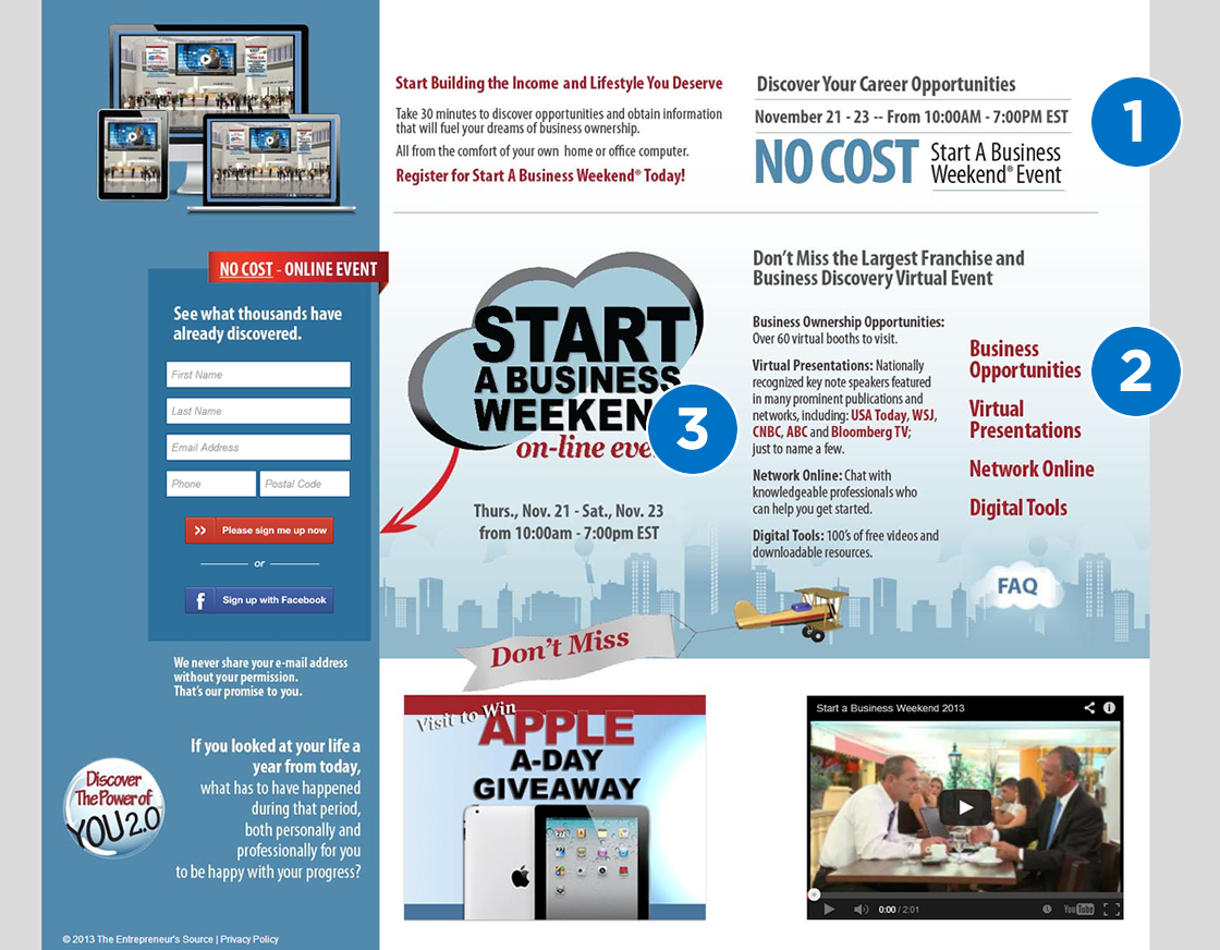
A Business Weekend
1. No clear CTA
At first glance I should be able to tell what the page wants me to do. Even after examining the header section I’m unsure what text to focus on. “Register for Start A Business Weekend Today!” should be the call-to-action and should be much more prominent. Learn more about how to create a solid CTA from marketing expert Tara Pickard: https://www.marketingoptimizer.com/blog/landing-pages/call-to-action/
2. Poor Organization
This information needs bullets of some sort to catch the reader’s eye and provide more order and division.
3. Hidden Trust Symbols
They missed an opportunity to highlight some great affiliates here. “USA Today, WSJ, CNBC, ABC and Bloomberg ” could have been utilized much better using logos.
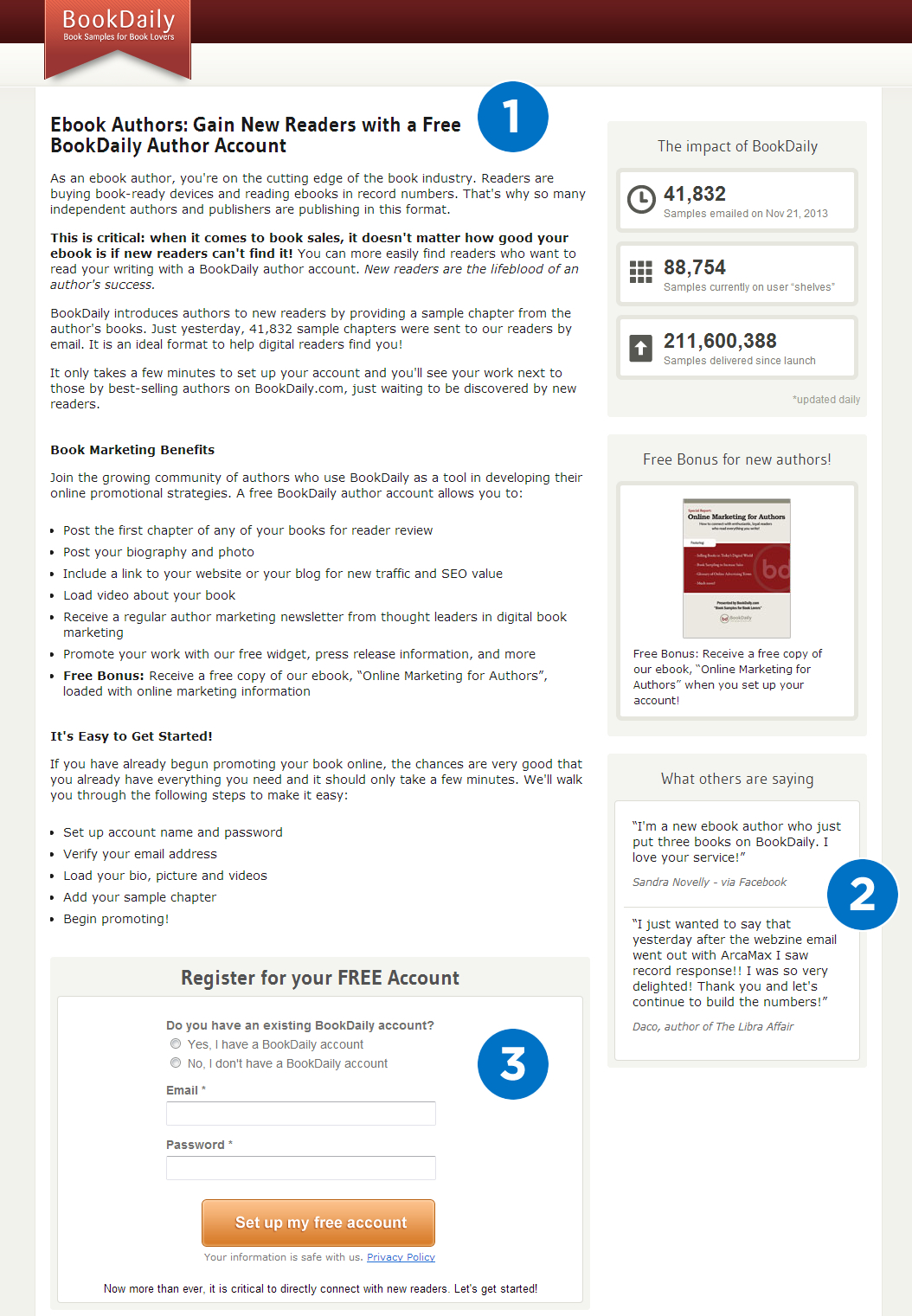
Book Daily
1. I think it’s naptime
I don’t want to read all of this unformatted text. The CTA could definitely be more exciting and engaging. The design is dreadfully boring. Simple and clean is good but this content needs more.
2. A waste of perfectly good testimonials
These testimonials could be what the top section of this page needs to give it some personality and credibility. It’s an awful shame they are lost below the fold.
3. Form is way below the fold
You shouldn’t have to scroll to register. This form should be in a prominent position, above the fold, so it’s easy to sign up. It would be awfully unfortunate to miss out on potential conversions with this rookie mistake.
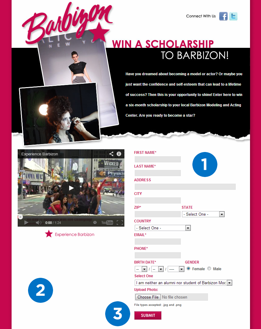
Barbizon
1. Form is a bit lengthy
lead generation forms should be kept as minimal as possible. People don’t want to mess with long forms unless they’re deeply invested. For an initial sign up, forms should be kept short with only required fields. An attractive headline would be a nice addition above the form fields also.
2. What a waste of space, trust symbols people, trust symbols!
This would be perfect placement for some trust symbols and/or testimonials that are featured in the video. I shouldn’t have to click play to see that this agency has models that have appeared on Project Runway, Mean Girls 2, Marie Claire, and the NY Fashion Week runway.
Recognized authority on landing page optimization, Oli Gardner says, “If you have an association with a company such as VeriSign, wear it proudly on your sleeve. ”
3. “Submit” as your button is awful
Make your button text valuable. Don’t be lazy. Think of something that your unique market of users will be dying to click.
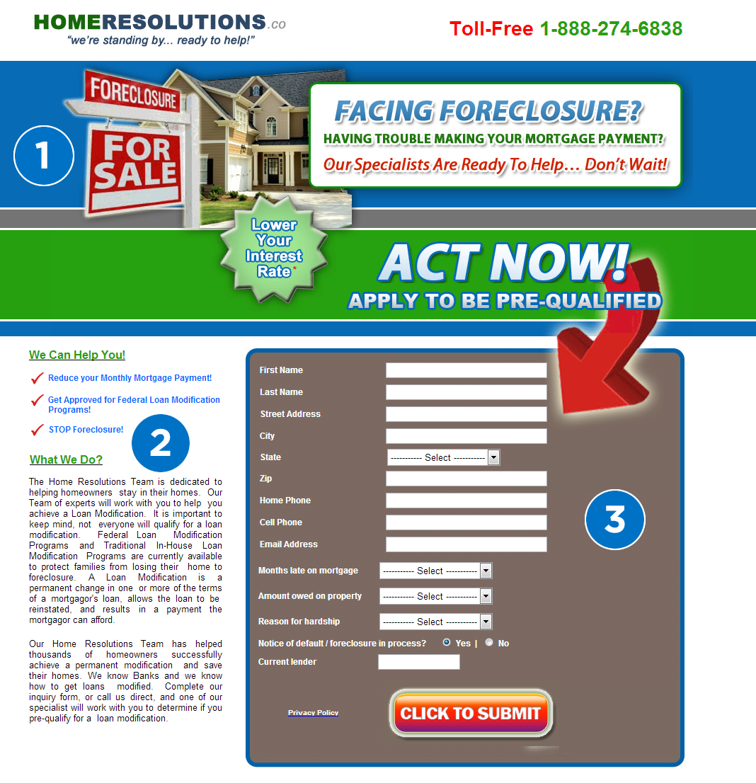
Home Resolutions
1. Ew
One, stock photos don’t add anything to your landing page. Two, these stock images are disgustingly cut out with unappealing glows. This page makes me nauseous from the fonts to the colors. A new designer is needed.
2. Tiny, weird text choices galore
I don’t approve of the inconsistent use of text throughout this page for the obvious awfulness that it creates. Enough said.
3. Another long ass form
Too many form fields to fill out once again. “Click To Submit ” is just as bad as “Submit, ” maybe even worse, because they actually did think about it and this was the result.
So there you have it, 5 awful landing pages and what actually makes them awful. Have any additional insight on how to make these pages better? Please share in the comments below. I shall see you there!