Your logo is a visual representation of everything your company embodies. It is crucial to ensure your company’s logo will stand out and visually represent your brand in order to engage your audience.
DESIGNING A GREAT LOGO
- Keep it Simple – when you are asked what you do and what your company does you probably have a “30 second commercial” ready to give. When you give your quick summary you don’t tell every detail or your complete business plan. The same idea goes for your logo, it should be easy to look at and understand. It shouldn’t try to explain it all.
- Be Color Conscious – color, or lack of color, is a great way to make a statement. Choosing the color(s) for your logo is so important because colors evoke many different emotions. Interpretations of color may be different based on age, gender and cultural demographics. Therefore be sure to do your research and choose wisely.
- Engage Your Audience – Above all your logo should entertain and engage your target audience. It is key to find the balance between telling your audience what your company does and creating an image that speaks to them. Your logo should make your target audience want to learn more about your company at first glance. It also should not be so abstract or confusing because you don’t want them to ignore it all together. Strike a balance. Things like color, contrast, font, etc. can help with this task.
- Choose Vector Graphics – While 3D illustrations and detailed effects are very nice to look at, they are not your best choice when designing a logo. A well done vector-based logo will serve you better and be more versatile because it offers contrast and balance which is extremely important for logo design.
- Be relevant, Memorable and Stay Away from Fads – It is important to design a logo that has longevity and won’t go out of style. It should be easy to update, memorable and not the latest fad or craze. Use clean, simple lines and streamlined shapes. If you’re not sure if your logo is memorable, show a friend and ask them to retrace it the following week. For longevity, one option is to stick with a typed-based logo. Thinking ahead about the direction your company may go with product or service is important to the logo design planning process.
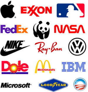
Ten Great Logo Examples
- Apple – by far one of the most memorable logos of its time and industry, Apple has revolutionized logo design. The chose a simple apple shape with a twist. The part of their logo that makes it great is that it is usually highly contrasted and can be updated with whatever color makes sense for the particular product or service.
- Nike – for similar reasons as Apple, Nike has become a truly memorable logo. It has simple lines and highly contrasted colors for bold recognition.
- Coca Cola – a type-based logo, Coca-Cola is memorable for its recognizable color and font. Even though the color has changed in some advertisements, the font has always stayed the same.
- Disney – again a font-based logo Disney is known for its fun and whimsical font choice. When Walt Disney is listed, it is also known for its simple castle rendition behind. Both concepts are easily remembered.
- Playboy – similar to the Nike and Apple concept, Playboy uses high contrasted colors and a bold image to make is logo very noticeable and memorable. Again, very easy to spot and remember.
- Mercedes– I personally love the Mercedes logo. It uses streamlined lines and shape to makeup its very memorable logo. Over time Mercedes has been able to add features to update their logo to make it more current or stand out more. It is great that their logo is easily updated to keep it current but still recognizable over time.
- McDonalds – though the famous golden arches that make up the McDonalds logo have changed and adapted slightly over the years, they have easily been updated to be current and have remained just as recognizable as always. The bold golden color used in contrast to the red color makes it stand out and easily to engage with.
- IBM – the current logo of IBM has been around for quite some time. They have been able to update by using different colors and prints within the font for more powerful advertising while keeping the font-based logo the same. Its bold font and contrasted color makes it stand out and remain memorable within its industry and even overall.
- CBS – I love CBS’s logo. It really gives insight into the meaning of what the company does and stands for. Though the true meaning and history of the memorable eye logo has been debated, it remains bold, powerful and extremely memorable.
- Twitter– though a relatively new company compared to the others I have mentioned; Twitter makes my list because of the cleverness and cleanness it displays. I love that their logo is a bird, uses clean lines and simple color and incorporated its logo into its terms and trends (tweet, etc.). In addition, they have been able to use a few variations of their logo to keep it trendy and relevant to the particular advertisement or marketing campaign being used. Each variation goes well with the other whether it be text-based or incorporates its trending bird.
FINAL THOUGHTS
Before you start to design your logo you must first understand what a logo really is, what it represents and what it means to you and your target audience. A logo is not just a splat of ink, it should represent your companies 30 second commercial and brand. Shapes, fonts, colors, lines and images help make this possible.
Take the time to create your companies identity and truly leave your mark. I will leave you with these final statistics to think about (by upstreammarketing.com):
- 32% of Americans don’t trust companies whose logos they don’t like.
- 63% of people said that a poorly designed logo made a brand look cheap.
- 44% believes that a simple design makes a better logo.
- 41% believes that color is important to logo design.
- 38% chose a brand because of a logo.
“Creativity is seeing what everyone else has seen, and thinking what no one else has thought.” – Albert Einstein