Creating the landing pages for PPC is a slightly different process from developing a landing page for organic traffic. Because the search intent tends to be more focused towards the end of the sales pipeline, the layout and the amount of information you provide to the customer will be much more specific. Because each of these clicks is being paid for, there should be little to entice the customer to not take the action you want them to take.
Because of this, having an actionable goal in mind for the customer when they arrive is key. Make sure to connect this to your ad – there shouldn’t be a difference between what you want the customer to do and what the customer thinks they will do when they click on the ad. For many, it’s getting the customer to buy a product or contact sales. If you provide any obstacles to this through a confusing layout, too much information, or omitting important details, the visitor is far more likely to bounce and “shop around” with another ad.
Developing the landing page
The initial development of your landing page will generally contain several key factors. While it can be effective to experiment with layouts and the positioning of key components, leaving out one of these factors completely is a big risk to take, and should be left for a variation of your landing page, and not the initial development. Consider the following factors when developing the initial layout of your landing page:
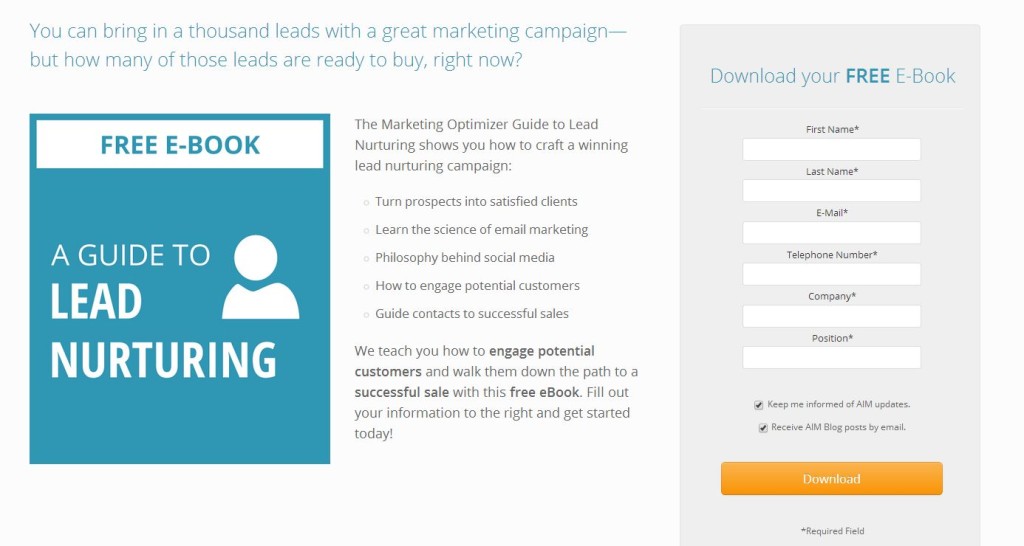
The common components of a landing page
- Headline: Your headline will let the visitor know they’ve arrived at the right place. This will likely be one of the largest aspects of your page and the first text that your visitors will focus on and will be the central part of keeping your visitor from bouncing. The other aspects of the page are often there to supplement or follow the headline – it’s what gives the rest of the page its context.
- Pictures: Although pictures are often a large feature of the page, make sure they supplement the rest of your content rather than pull your visitors’ eyes away from it. It can be very easy to pick a picture that’s loud and eye-catching, but remember – you’ve already got them on the page, and your ad was the eye-catching part. Often, the picture will sit near the natural center – about 1/3 in from the left and top of a page, and is a great way to “point” the visitor towards the content.
- Heat Maps: Heat maps are excellent ways to determine exactly how people are navigating your pages. They determine what the eyes (or mouse) are doing the most on a particular page. Think of the layout of the page in a way that you would think of a layout for a traditional print ad – in what ways do the eyes travel naturally down the page? Remember that the natural center is not the top of the page, but a little bit further down. This can help you format your content so that the hottest parts of the page don’t belong to outside navigation or related products, and instead go to your headlines and calls-to-action.
- Buttons: People don’t like to click that often to find what they need. The only button that should be the focal point is the one that gives them exactly what you advertised, and this button should follow naturally from the headline. Don’t provide too many steps or options that could distract from the product you’re selling. It can be tempting to entice the customer with other options and products, but if you do add this in, make sure it supplements your page and doesn’t distract from it.
- Navigation: Keep the page clean and easy to read and navigate. This also follows along with the buttons – don’t provide too many ways for the visitor to leave the page before they’ve taken the appropriate action, even if it’s an internal link. Adding your normal website navigation to the top of your page is not necessary, and can sometimes distract from the message of your landing page if it’s a particularly extensive menu.
- Your Ad Group: The content of your landing page should reflect your ad, or at the very least, your ad group. Selling a particular product? Reference it in the landing page – try not to use too many generic landing pages that could apply to many different ad groups (although combining similar groups is a good-time saver). The person clicking on the ad wants to see what they clicked on – the best visitors are already too far down the sales pipeline to worry about anything else.
- Headline: The headline can be a descriptive headline for a product, especially if that exact model is required. For many products and services, the headline should pitch a benefit that your product offers, especially if it works concurrently with your unique selling point. This is your second attempt to win them over (the first being your ad) and you certainly don’t want to lose them here because you’ve already paid for that click.
- Pictures: When using humans, animals, or other anthropomorphic mascots, make sure that they’re not directing their eyes and bodies away from the rest of your content, especially your headline. People tend to look where others are looking, and that includes images of others. Sometimes it’s just a matter of flipping the image to direct their “gaze” towards your headline and call to action.
- Call to action: You’ve managed to keep your visitor from bouncing with a good headline and great content. Make sure they still know what to do. This call-to-action should match your ad, and the medium you give them for performing that action (clicking the button, calling) should be nearby the call to action. Don’t make them hunt.
- Contact Forms: What information are you asking in your contact form? If it’s the primary form of reaching your leads, asking for more information is a good idea – this will not only make sure you’ll be able to make contact with the person that filled it out, as people will often leave information off if you let them. Additionally, this can weed out wasting time on potential leads that aren’t really interested enough in your product to provide information to you.
- Body: How much body you need to describe your product or service is largely determined by your vertical. Does it need additional specs that didn’t fit in the ad, like a computer? Does the visitor need assurance that their decision to call is worthwhile, like a drug rehab? Err on the side of less – it’s much easier for a visitor to get distracted by a cluttered page rather than confused by a minimalist page, especially since these visitors are clicking from an ad, and therefore are more likely to already be knowledgeable about the product.
- Accreditations: These are important for health, finance, and similar institutions where a lot of personal information is required. If you’re not a part of any, research organizations and groups that provide accreditation for your vertical. Most provide badges that you can use throughout your website.
- Cards Accepted: If you need a credit card number, let users know which cards you accept – it implies you’re not there just to grab cards, especially if you don’t actually accept a certain brand.
- Privacy Policy: This doesn’t have to be a focal point, but should be easily accessible from your landing page, and let the visitor know exactly what you’re going to do with the information they give you.
- Lock or other indication of https: Sometimes the simple things can help – if you use a form, use a lock or another indication that the information they’re provided is secured. Not everybody looks for the https: in the url, but they want to know their information is secure.
- Logo: Not only does this help provide a sense of trust by connecting a company with the landing page, but it also helps with branding your company. Again, it doesn’t need to be a focal point, but a logo in a top corner that links to the front page can help a customer feel more comfortable with a purchase. Those who are unsure can quickly check you out without having to do any additional searching on your product.
- social media: Having active social media pages will instill a sense of trust because visitors can see how real customers have reacted to your company or product. Invite them to share the page and write their own opinion, as there’s nothing secret about your product or company.

- Everything is centered except the button – it feels awkward
Your vertical can have an effect on how you layout your landing page, especially when it comes to how much actual content you should provide on the page. Have a more complex product? Likely, more text is going to be required – but not just to describe the product. Because complex products and services are often bigger purchases, an emotional appeal is needed (and described in detail below) and this will often require more room for content.
Creating the right content
Knowing what kind of information to provide on a landing page and in what amount will depend largely on not just your product, but your overall vertical and target market. Because the visitor who clicked on the ad generally knows they’re clicking on an ad, they will expect to be provided with enough information to know they’re taking the right action, a way to take that action, and little else.
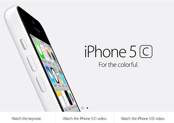
- Notice how the phone “faces” the headline?
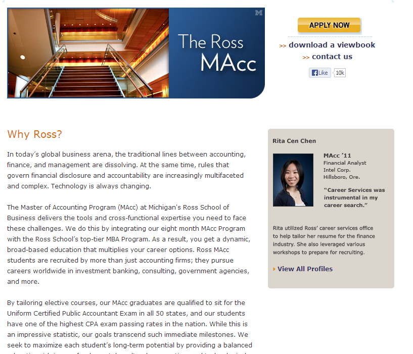
Some verticals, like education, may need more content
Adding trust indicators
While they are often overlooked, trust indicators are an easy and excellent way to entice your customers to take the next step and provide you with needed information. In a society where identity theft is rampant, visitors are very cautious about what information they give away, and they’ll look elsewhere if they don’t trust the site they’re on to keep their information safe.
The types of trust indicators you can use can be directly related to the security of the site or lend to the legitimacy of your business. Both are extremely helpful, especially if you are competing against large companies that have their brand presence as a big trust indicator, like Amazon or Zappos. There are several different types of indicators you can use, and they apply in different ways depending on your vertical:
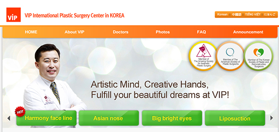
- Accredited in Korea and America

- Verified security by a generally trusted third-party
Testing multiple variations
You’ve got the right landing page set up and ready to go – now it’s time to change the page up. No page will ever be a completely perfect fit for your visitors, and even if it was, tastes and trends change, making the need for testing variations impertinent. With the right process for testing, your pages can continually improve, improving your ROI without the need to increase your cost-per-click.
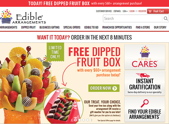
Could this landing page be more delicious in the conversion department?
Like with ads, make sure you know what’s getting changed on the page before making the variation. It can be great to know that one page is working better than another, but knowing why that page is working better will lead to even better landing pages in the future. It would be unfortunate to change a good part about a page in a subsequent test because the two variations were just too different from each other to determine exactly what was working and what wasn’t.
Keep the control at a higher percentage of views than the variation – if you drove half of your traffic to the new page and it wasn’t as successful, it’s going to be a lot worse than if only 10% were going to an unsuccessful page. Successful pages will become the new control, and get 90% of the traffic at that point.
Be sure there’s enough data to make a confident decision. Our Marketing Optimizer WordPress plugin can help with determining confidence levels automatically while the test is performing, and works with WordPress-based websites.
Consider the most important parts of the page as factors for change – having a green or blue button can sometimes make a difference, but most of the time the difference is negligible. Instead, focus on different headline text, page layouts, and images that may help entice your visitors to take action.
