The seventh step in Active Marketing’s branding process is creating the typography palette. In short, typography is where text meets art. It is the font family, size, color, shape, style that makes up every single word on the page – from headline to call to action.
What Are the Benefits of Great Typography?
When a visitor looks at your page, they look at it as a whole and subconsciously decide whether or not it is worth reading. This decision is made almost instantaneously and is affected by the layout, the images, the length of each section and the font size that is used. We all do it – try paying attention to your thought process the next time you skim a webpage. What draws you in? What turns you off? Does the font or style have any effect on your attitude towards the brand?
Finding the perfect font family for your message, voice and personality is an art form that may seem insignificant, but has been scientifically proven to increase site traffic and conversions. The right typography in the right place should make skimming a page or finding information effortless so that they can focus on what is being said rather than be distracted by poor formatting choices.
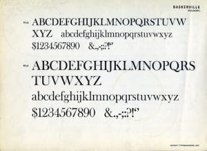
If you want to get a more formal, informative message across, Baskerville may be the way to go, as opposed to a more laid back, casual message, which may call for a Comic Sans font. Choosing the wrong font for your message could confuse your reader and scare them off. If your copy is hard to read, too big, too small, too light, too dark, too anything but perfect, your visitor will bounce, decreasing your conversion rate.
Key Elements of Typography
There are several elements that make up typography. A few of the main components include:
Font Face – The style of font used
Font Weight – How heavy, or bold, the font is
Size – How big or small the copy is
Color – What color the copy is
Capitalization – Where and when to use capitals
Italicization – Where and when to use italics
Creating the Palette
In order to create a full typography palette for you, we will find two to three fonts – one that will be used as the primary, and two that will be used for accents, headings, graphics and your logo – that will accentuate your brand personality and reinforce it, making it even more apparent to prospective clients and current customers.
As you can imagine, everything we’ve worked on up until this point is essential in writing a set of strict guidelines to follow in all of your marketing materials – print, online, television and everything in between. These guidelines will be comprehensive and include the details necessary to make it clear which styles should be used and when, by us and by future marketing companies.